Understanding the Role of Content Modeling and Information Architecture
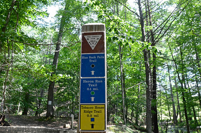
Imagine going on an adventure in the woods and relying on two different systems of trails that allow you to walk or wheel your way through the area. One system has well-maintained signs that are simple to navigate with easy to follow paths. On this trail system, you have a clear sense of where you’ve been, where you are presently, and where you’re going next. Each trail intersection is plainly marked and as you navigate them you come to understand how the trails interconnect – which ones loop off of each other, which ones run in parallel, and how long they are.


In contrast, the other trail system is in poor condition. Paths are overgrown, trail signs are missing or faded, the markings are confusing, and you can find yourself in unexpected situations such as a trail that ends abruptly or that circles on itself with no apparent exit.
Which hike would feel enjoyable? Which one would be stressful? Which trail system would be worthy of your time?
When planning out web strategy, it may be helpful to think about your web content and how it is arranged on your site in a manner similar to a trail system. Two important concepts to aid your efforts are:
- information architecture, which is the practice of organizing the information, content and functionality of a web site so that it presents the best user experience it can, with information and services being easily usable and findable, and
- content modeling, which is a method for achieving effective information architecture. Content modeling documents all of the types of content you have on your website, both now and in the future. When done effectively, content modeling helps you identify the essential parts of your content and how those parts relate to each other. By doing this, you’ll create a taxonomy structure for all of your content, similar to how someone designing a trail system will define meaningful, logical symbols and language for trail signs.
Currently, we are engaging in content modeling for the med.wisc.edu website as we consider different information architecture scenarios. Some key considerations include:
Identify how many clicks it takes for users to get to important content
Click depth is the number of clicks it takes to go from a homepage to another page on a website. If you’re trying to ensure that important content on your site is easily found by users, confirm that the critical pages are easy to get to from the web site’s home page. The ease a user experiences in getting from the home page to key content should be your main focus. You’ll have to make some choices; not all pages can be given equal prominence, because that would overwhelm users. For a web site with thousands of pages, for example (the med.wisc.edu website has over 1,700 pages at present), you must clearly identify what information is most important for users. Note that click depth matters more than URL structure. Your consideration of the user experience is paramount; always let this be your guide for decision-making about structuring your content.
Make choices based on the user journey, not rigid rules
While click depth is important, that doesn’t mean that this translates to hard-and-fast rules. For example, you may have heard well-intended advice to never have key information on a web site more than three clicks away from a home page. In reality, it’s not that simple because, well, humans are not that simple. This 3-minute video explains why the three-click rule is nonsense. Just like the “drink at least eight cups of water per day” popular wisdom that was recently debunked by researchers at UW-Madison, the three-click rule wasn’t based on data or research. The basic tenet is true, however: users want to do the least amount of work they need to in order to find the info they are looking for. But some clicks require more mental effort than others.
Think of clicks like currency. The harder you have to think to figure out where to click, the higher the currency. Some clicks are like a $1 bill; it may be so easy to make the decision to click that you hardly notice you’ve done it. Other clicks are more like a $5 or $10 bill. The effort of deciding brings you some pause. There’s enough struggle in the decision that it may interrupt your train of thought. When structuring your content, your goal should be to make clicks as effortless as possible. Users would rather hand over four $1 bills than a single $5, in terms of cognitive load.
Easier or “less costly” links are clear and instantly meaningful to users, do not contain jargon or branded terms, are short, and put the most important word first so users have to read as little as possible.
Navigation structure should be obvious, and it should match the expectations of your users. In general, users want to feel like they are making progress towards their goal – especially if it takes several clicks to get there.
Decide whether your web site is better suited for flat vs. deep hierarchy
It’s possible to take the same body of content and organize it into a flat structure (with only a few vertical levels; for example, all pages are only a few levels away from the home page) or a deep structure (in which the same content is organized into many sub levels). As this article describes, both structures have advantages and disadvantages.
- Flat hierarchies can make content more discoverable because it’s not buried under multiple intervening layers. All other things being equal, deep hierarchies are more difficult to use.
- Deep hierarchies can accommodate more content, but they may disorient visitors.
Categories that are specific and do not overlap are the easiest for users to understand. This cuts both ways: In deep hierarchies, when there are only a few categories on each level, they tend to be more generic and, thus, more confusing. A flatter hierarchy with more categories at each level usually has “more-specific” labels that are easier to understand. However, in broad hierarchies with a very large number of items, there is often some conceptual overlap between at least a few of the categories. Users can also become overwhelmed with long, cluttered menus.
Think about your “trail system” from the beginning, and keep it well-maintained
There are many decisions to be made about how you organize your site. As you imagine users interacting with your content, think of it as if you’re building a trail system to explore a forest. Be deliberate about your strategy, and don’t let your “trail signage” fall into disrepair. Most web sites expand in size over time. Make taxonomy choices that will accommodate the type of hierarchy that will be most suitable for the needs of your users in the long run. Determine what will make sense to users as they navigate the information you present to them. Be logical and consistent with your information architecture to keep people from being disoriented, and use content modeling as an ongoing method to keep them – and you, as a content strategist – on the right track.